
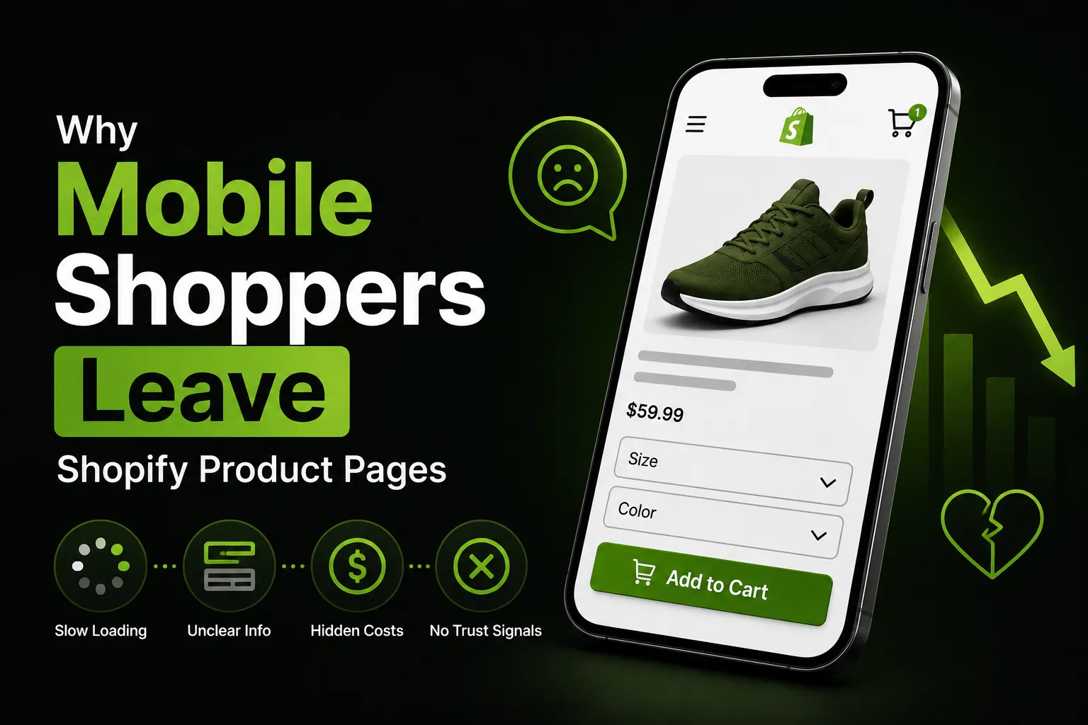
Why Mobile Shoppers Abandon Shopify Product Pages (and How to Fix It)
Mobile devices drive more than half of global ecommerce traffic — yet mobile shoppers consistently convert at lower rates than desktop users. The gap isn’t because mobile shoppers are less serious buyers. It’s because the experience of shopping on a small screen introduces friction that desktop doesn’t, and product pages are often where that friction is highest. This guide looks at the specific reasons mobile visitors leave without buying, and what you can actually do about it.
How Big Is the Mobile Conversion Gap?
The gap is real and well-documented. Aggregated ecommerce data puts average mobile conversion rates at roughly 2–3%, compared to 3–4% on desktop. Mobile cart abandonment rates are also higher than desktop — some analyses put mobile abandonment above 85%, versus around 73% on desktop.
The reason this matters for product pages specifically: cart abandonment data tracks people who got to the cart. Lots of mobile friction happens before that — visitors who leave the product page without ever clicking “Add to Cart.” Your add-to-cart rate on mobile is the metric to watch here.
None of this means mobile is a lost cause. It means there are specific, fixable problems that disproportionately affect small-screen shoppers.
Why Do Mobile Shoppers Leave Product Pages?
Is the Add-to-Cart Button Easy to Reach?
On a desktop, the product image, title, price, and add-to-cart button typically all appear above the fold — visible without scrolling. On a phone, that’s rarely the case. Even a modest product page often pushes the ATC button below multiple images and several lines of text.
When a customer finishes reading the description, checks the reviews, and decides to buy — and then has to scroll back up to find the button — that’s a small but real friction point. On mobile, where the instinct to close the tab or get distracted is stronger, “small friction” matters more.
A sticky add-to-cart bar addresses this directly. Rather than the button disappearing when the customer scrolls past it, a sticky bar keeps a persistent “Add to Cart” option visible at the top or bottom of the screen throughout the entire page. It doesn’t require any scrolling back. For more on how these work and how to add one to your store, see How to Add a Sticky Add-to-Cart Button to Shopify.
Is the Page Slow to Load?
Page speed matters everywhere, but mobile users — often on cellular connections — are more sensitive to it. A product page that takes 4–5 seconds to load on a phone loses visitors before they even see the product.
The most common culprits on Shopify product pages:
- Unoptimised images. Large, uncompressed image files are frequently the biggest contributor to slow load times. Use modern formats (WebP where your theme supports it), compress images before uploading, and only include the number of gallery images that genuinely help the customer decide.
- Too many third-party scripts. Every app that loads a script adds weight. Audit your installed apps and remove ones you’re not actively using.
- Theme code bloat. Some themes load resources (fonts, scripts) that aren’t needed for every page. A developer can audit this, or you can use a lighter-weight base theme.
Test your product pages with Google PageSpeed Insights and specifically look at the Mobile score. A score below 50 on mobile is worth addressing.
Are Tap Targets Big Enough?
Interactions that work fine with a mouse cursor can be frustrating on a touchscreen. The main offenders:
- Variant selectors (size buttons, colour swatches) that are too small to tap accurately
- Quantity selector arrows that are close together
- Links within the product description that are hard to target
Google’s guidelines suggest interactive elements should be at least 48×48 CSS pixels. Check your variant buttons and any interactive elements on a real phone — not just in a browser’s responsive design mode.
Is the Layout Breaking on Small Screens?
A product page that looks great on a 1440px desktop can render awkwardly on a 375px phone. Common issues:
- Text that overflows or gets cut off
- Images that don’t scale properly
- Side-by-side layouts that stack in unintended ways
- Overlapping elements (a chat widget on top of the ATC button, for example)
Check your actual product pages on multiple real devices — at minimum, a small iPhone size and a mid-range Android. Browser emulation doesn’t catch everything.
Does the Page Take Too Long to Get to the Point?
Mobile shoppers tend to scan rather than read, and they make faster decisions about whether to stay or leave. A product page that leads with a long brand story before the product details forces extra work on the mobile visitor.
A practical audit question: if a customer lands on this page and has 10 seconds, can they understand what the product is, what it costs, and how to buy it? If not, the hierarchy needs rethinking.
What Actually Moves the Needle on Mobile?
Fix the biggest frictions first
Not all fixes are equal. The highest-leverage changes for most stores:
- Make the ATC button reachable without scrolling back up. A sticky add-to-cart bar is the most direct fix. Sticky Add To Cart – CartLift adds one via a theme extension — no code editing required — with variant sync, quantity picker, and built-in analytics. There’s a 7-day free trial.
- Optimise your images. Compress files before uploading and remove any gallery images that don’t add useful information. Faster loading on mobile directly affects how many people stay on the page.
- Test on a real phone. Browser responsive mode is not the same as a real device. Buy a mid-range Android handset (they represent a large portion of ecommerce traffic) and actually shop your own store.
- Check page speed with PageSpeed Insights. Mobile score under 50 is a meaningful problem. Under 30 is urgent.
What not to overdo
Mobile optimisation gets oversimplified sometimes into “just make the page shorter.” Cutting content that customers need to make a decision is counterproductive. The goal is to make the right content easier to find and consume on a small screen — not to remove it.
Similarly, adding a sticky bar won’t fix an underlying page problem. If the product images are unclear, the description doesn’t answer real questions, or there are no reviews, the sticky bar doesn’t change that. Fix the fundamentals first.
For more on what a well-optimised product page looks like holistically, see Shopify Product Page Best Practices to Increase Conversions.
For context on what happens after the product page — cart and checkout abandonment — see How to Reduce Cart Abandonment on Shopify.
For a full breakdown of all the factors affecting your add-to-cart rate, see How to Boost Your Shopify Add-to-Cart Rate.
Frequently Asked Questions
Why is my Shopify store’s mobile conversion rate lower than desktop? Mobile product pages typically require more scrolling, are more sensitive to slow load times, and involve smaller tap targets — all of which create friction that desktop doesn’t. The gap is common across ecommerce, not specific to Shopify. Fixing it means reducing that friction: faster pages, a visible add-to-cart button, and a layout that works on small screens.
What is a good mobile conversion rate for a Shopify store? Average mobile conversion rates for ecommerce stores tend to land in the 2–3% range, versus 3–4% on desktop, based on aggregated industry data. What’s “good” depends heavily on your product category, price point, and traffic source — these are rough reference points, not targets to hit regardless of context.
Does a sticky add-to-cart bar help on mobile? Yes — mobile is where it tends to help most. On a phone, the original ATC button often scrolls out of view quickly, and getting back to it requires deliberate navigation. A sticky bar keeps the buy button accessible at any point in the scroll, which removes a specific type of friction that’s particularly common on mobile product pages.
How do I check if my Shopify product pages are fast on mobile? Use Google PageSpeed Insights — paste your product page URL and check the Mobile score. A score below 50 is worth addressing. The tool also shows specific issues to fix, ranked by their potential impact on load time.
What causes high mobile abandonment on product pages specifically? The most common causes: the add-to-cart button requires scrolling back up to reach it, images load slowly on cellular connections, variant selectors are too small to tap accurately, and the page layout doesn’t translate well to small screens. These are all separate problems that may need separate fixes.
Should I create a separate mobile version of my product pages? For most Shopify merchants, no — maintaining two versions is operationally complex and modern themes are designed to be responsive. The better approach is to audit and improve your existing pages so they work well on small screens, rather than building and maintaining a separate mobile experience.
 Sharfaraz Ahmed


