
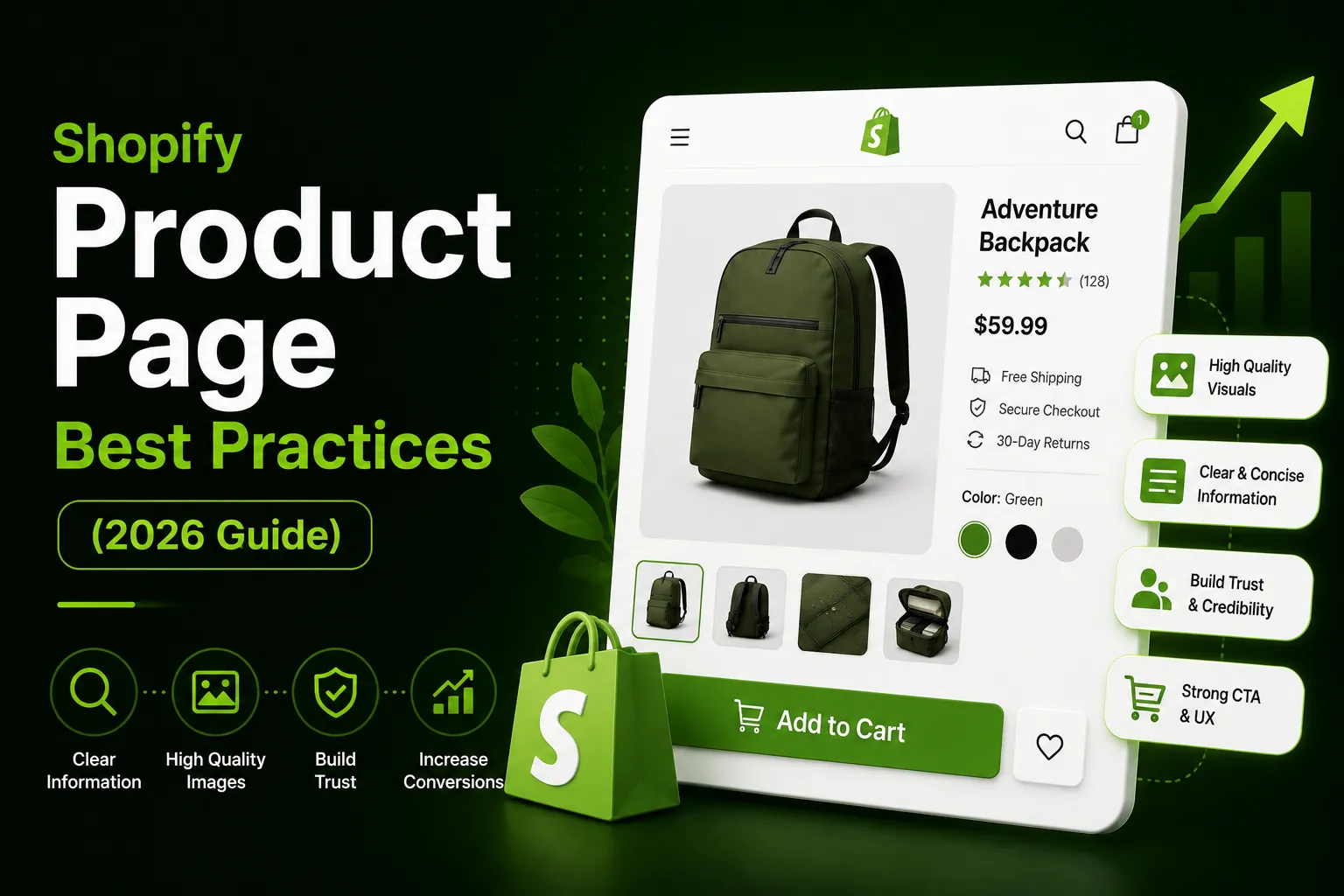
A product page has one job: give visitors enough confidence to click “Add to Cart.”
Most Shopify stores fail at this — not because of bad products, but because of avoidable friction. Slow load times, missing trust signals, buried reviews, and add-to-cart buttons that disappear on mobile are silently costing store owners thousands every month.
At eComFixR, we’re a verified Shopify Select Partner agency that has optimized 100+ Shopify product pages for DTC brands in fashion, beauty, health, and supplement niches. The fixes in this guide come from patterns we see across real stores — not from theory.
Here are 15 product page best practices that consistently move the needle.
Fix 1: Make Your Product Images Do the Heavy Lifting
Images are the primary selling tool on any product page. Customers cannot touch or try the product — your photos have to answer every question they would otherwise ask in person.
What to include as a minimum:
- Multiple angles showing the full product — front, back, side, and any details that affect the buying decision
- At least one lifestyle or in-context image showing the product in real use
- A size or scale reference where relevant — a hand holding it, worn on a model, or placed next to a familiar object
- Close-ups of texture, materials, labels, or features that matter to the buyer
Practical quality bar: images should be sharp enough to zoom without pixelating. They do not need to be studio productions for every SKU, but they do need to be well-lit, in focus, and consistent across the page.
What to avoid: ten nearly identical angles that add no new information, or generic stock images that do not reflect the actual product.
The impact: stores that add lifestyle imagery alongside standard product shots typically see 20-30% higher engagement on product pages. Buyers need to picture themselves using the product before they commit.
Fix 2: Write Product Titles That Are Clear and Searchable
Your product title serves two audiences — the customer scanning your page and the search engine deciding where to rank it.
A title like “The Classic” communicates nothing. “Men’s Merino Wool Crew Neck Sweater — Navy — 100% Organic” tells the visitor exactly what it is, who it’s for, what it looks like, and what it’s made of.
Include these where relevant:
- Material or key ingredient
- Size type or fit description
- Color or finish
- Key differentiator (organic, waterproof, vegan, etc.)
The balance to strike: keyword-rich without becoming a keyword dump. Clarity for the human reader comes first. Search visibility is a close second.
Fix 3: Write Descriptions That Answer Real Questions
Thin descriptions leave customers with unresolved questions. Unresolved questions lead to exits. Every line of your product description should earn its place by answering something the customer would actually wonder about.
Cover these in every description:
- What the product is made of — materials, ingredients, construction
- Dimensions, sizing, or fit guidance
- Who it is for and what specific problem it solves
- What makes it different from generic alternatives — without being vague or hypey
- Anything that affects compatibility, fit, or usage
Format matters as much as content, especially on mobile. Break descriptions into short paragraphs. Use bullet points for specs, dimensions, and features. Use prose for the parts that benefit from explanation. A wall of text is impossible to skim on a phone — and 70% of your traffic is on mobile.
What to cut: generic superlatives like “world-class quality” or “you’ll love it” that give the customer zero useful information. Replace every vague claim with a specific fact.
Fix 4: Place Reviews Where They Drive Decisions
Social proof is one of the most powerful trust signals on a product page. But placement determines whether it actually influences the buying decision — or just sits unread at the bottom of the page.
Best practices for review placement:
- Show a star rating summary — average score and review count — near the product title or price. It should be visible without scrolling on both desktop and mobile
- Place the full review section lower on the page but make it easy to reach via an anchor link or tab
- Prioritise reviews that mention specific product details — fit, material, durability, results — over generic “great product!” feedback
- If you have volume, filter for reviews that address the most common pre-purchase questions
If you have zero reviews: prioritise getting them via post-purchase email. A product with no reviews is not necessarily a red flag. A product page that looks abandoned is.
Fix 5: Make the Price Impossible to Miss
Price confusion is a trust killer. Customers who cannot find the price quickly assume there is something to hide — and they leave.
Non-negotiable price page requirements:
- Price visible above the fold without scrolling — on both desktop and mobile
- Sale pricing shows both original and discounted price with clear visual differentiation
- Any required accessories or add-ons that affect total cost are flagged upfront
- Shipping cost or free shipping threshold is visible near the price — not hidden until checkout
Hiding or downplaying price until the checkout stage is a losing strategy. Customers surprised by cost at the end are more likely to abandon — and far less likely to return.
Fix 6: Put Trust Signals Next to the Buy Button
Most Shopify stores have trust signals — but they put them in the wrong place. A return policy buried in the footer does not help a customer who is hovering over the add-to-cart button.
Trust signals that belong near the ATC button:
- Return policy summary — even one line like “30-day returns, no questions asked” reduces perceived risk at the moment of decision
- Secure payment icons — confirms the customer’s preferred payment method is accepted
- Stock levels — “Only 4 left in stock” creates urgency, but only use real numbers. Fake scarcity is a short-term tactic that permanently damages trust when buyers notice it
- Guarantee or warranty information — if you offer one, say so clearly near the buy button
The rule: anything that reduces purchase hesitation belongs near the add-to-cart button — not at the bottom of the page where the hesitant buyer has already left.
Fix 7: Make the Add-to-Cart Button Unmissable
The ATC button should be the most visually prominent interactive element on the page — not competing with navigation, banners, or promotional text.
Requirements for a high-converting ATC button:
- High contrast color that stands out clearly from the page background
- Clear, unambiguous label — “Add to Cart” or “Add to Bag” beats anything clever
- Large enough to tap accurately on mobile without misfiring
- Positioned above the fold on desktop — visible without scrolling
The scroll problem on mobile: on image-heavy product pages, the original ATC button disappears as customers scroll through images, descriptions, and reviews. By the time they decide to buy, the button is nowhere in sight. A sticky add-to-cart bar solves this by keeping a persistent buy button fixed to the screen throughout the scroll.
This is one of the highest-impact, lowest-effort fixes for mobile product pages. Our own app, CartLift — Sticky Add to Cart, adds a sticky bar via theme extension with no Liquid editing required, full variant sync, and built-in analytics. It has a 7-day free trial.
Fix 8: Make Variant Selection Frictionless
If your product has variants — size, color, material, flavor — the selection experience directly affects conversion. Complicated or confusing variant selectors create hesitation right at the point of decision.
Common variant problems to fix:
- Options that are too small to read or tap on mobile
- No indication of which variants are out of stock until after the customer selects them
- Sticky ATC bars that do not sync with the variant selected on the page — so the customer adds the wrong item
Fix out-of-stock visibility: gray out unavailable variants rather than hiding them. Seeing that a size is unavailable is less frustrating than selecting it and being told afterward.
Fix the sticky bar sync issue: a well-built sticky bar updates dynamically as the customer changes their variant selection. If yours does not, it creates confusion and incorrect orders.
Fix 9: Fix Page Speed on Mobile
A product page that loads slowly loses visitors before they engage with a single word of content. The most common Shopify speed killers: large unoptimized images, too many third-party app scripts running simultaneously, and theme code loading unnecessary resources.
How to check: run your product pages through Google PageSpeed Insights. Focus on the Mobile score — it is almost always lower than Desktop and it is where the real traffic loss happens. A mobile score below 50 is worth addressing urgently.
The most common fixes:
- Compress and properly size all product images before upload
- Audit your installed apps — remove any you are not actively using, as each one adds script load
- Enable lazy loading for images below the fold
- Minimize or defer JavaScript that is not critical to page load
Speed improvements are not glamorous but they are foundational. A one-second improvement in mobile load time can increase conversions by 8-12% according to Google’s own research.
Fix 10: Add Product Video Where It Replaces Questions
Not every product needs video. But for products where motion, texture, scale, or real-world use are hard to convey in photos — video fills the gap that images leave.
Products that benefit most from video:
- Clothing and apparel — how it moves, how it fits on different body types
- Beauty and skincare — application technique, texture, before and after
- Kitchen equipment — how it works, what it produces
- Supplements and health products — unboxing, ingredient explanation
Where to place it: as the first or second item in the image gallery, not buried at the bottom of the page. Autoplay on mute works well for short demonstration clips. Keep product videos under 60 seconds for maximum completion rate.
What to avoid: long brand films that play before the customer has even seen the product. Save brand storytelling for the About page. Product pages need product-focused content.
Fix 11: Use Upsells and Bundles Before the Checkout
Upsells placed on the product page — not just at checkout — capture revenue from customers who are already in buying mode. The key is placement and relevance.
What works on product pages:
- Bundle offers positioned above the ATC button — “Buy 2, Save 15%” as a radio button selector, not a separate section
- Frequently bought together — relevant complementary products, not random recommendations
- Volume discounts clearly displayed near the price — “Buy 3+ and save 20%”
What does not work: generic upsell popups that interrupt the buying flow, or cross-sells that have nothing to do with the product being viewed.
Our BundleLift app lets you add bundle and quantity discount offers directly to the product page with no code changes. When we recommend bundle upsells in a CRO audit, we can implement them using our own tool — which means faster testing and fewer integration issues.
Fix 12: Make Shipping Information Visible on the Product Page
Unexpected shipping costs at checkout are the single biggest cause of cart abandonment globally. The fix is simple: tell customers what shipping will cost before they reach checkout.
What to show on the product page:
- Free shipping threshold — “Free shipping on orders over $50”
- Estimated delivery timeframe — “Ships in 1-2 business days”
- Return shipping policy — especially important for apparel and footwear
- Express or priority shipping options if available
A one-line shipping summary placed near the price or ATC button removes one of the most common objections before it forms. This single addition has measurably reduced abandonment on multiple stores we have worked on.
Fix 13: Optimize Product Page Titles and Meta Descriptions for SEO
Every product page is a landing page with SEO potential. Most Shopify stores waste this by leaving auto-generated meta titles and descriptions in place.
For meta titles: include the primary keyword, the brand name, and a key differentiator where space allows. Keep under 60 characters.
Example:
Men’s Merino Wool Crew Neck Sweater | Navy | BrandName
For meta descriptions: write for the searcher, not the algorithm. Answer the implied question behind the search query and include a soft call to action. Keep under 155 characters.
Example:
Shop our 100% organic Merino wool crew neck in 8 colours. Free shipping over $50. 30-day returns. Find your size today.
For image alt text: describe the image naturally using the product name and key attributes. “navy-merino-wool-sweater-front-view” is better than “IMG_4521” or a keyword-stuffed string.
Our Bulk Alt Tag Optimizer app lets you update image alt text across your entire catalog in bulk — without touching each product individually.
Fix 14: Add an Exit Recovery or Back-in-Stock Mechanism
Not every visitor who leaves your product page is lost forever. Two mechanisms help recover intent before it disappears completely.
Exit intent for product pages: a trigger that fires when the cursor moves toward the browser close button — offering a discount, free shipping, or a reminder to save the product. Use sparingly and only when the visitor has shown genuine engagement (scrolled past 50%, spent 30+ seconds on page).
Back-in-stock notifications: for out-of-stock variants, an email capture instead of a dead end. “Notify me when back in stock” converts a lost sale into a warm lead. Shopify has native support for this — make sure it is enabled.
Both mechanisms extend the lifespan of your product page traffic beyond the initial visit.
Fix 15: Track the Right Metrics to Know What Is Working
Optimizing a product page without tracking the right metrics is guessing. These are the numbers that tell you whether your changes are actually working.
Key product page metrics to monitor:
- Add-to-cart rate — the primary conversion metric for product pages. Industry average is 5-8%. Below 3% warrants investigation
- Product page bounce rate — high bounce often means a mismatch between ad creative and product page content
- Image engagement — which images are being viewed most, and in what order
- Scroll depth — how far down the page customers are getting before they leave
- Variant selection rate — which options are being selected and which are being ignored
How to get this data: Shopify Analytics covers add-to-cart rate and basic funnel data. Google Analytics 4 gives you scroll depth and behavior flow. Heatmap tools like Microsoft Clarity (free) or Hotjar give you visual session recordings that show exactly where users drop off.
If you want expert eyes on your specific data, we offer a Shopify CRO Audit that covers your full product page funnel — with prioritized fixes ranked by revenue impact.
The Fastest Wins — Where to Start
If you cannot implement all 15 fixes at once, start here in this order:
| Priority | Fix | Why First |
|---|---|---|
| 1 | Sticky ATC button on mobile | Highest impact, fastest to implement |
| 2 | Star rating near the title | Instant trust signal, no design changes |
| 3 | Shipping info near the price | Removes biggest abandonment trigger |
| 4 | Trust badges near ATC | Reduces risk perception at decision point |
| 5 | Image quality audit | Foundation of all product page conversion |
Frequently Asked Questions
What makes a high-converting Shopify product page?
High-converting product pages answer the customer’s questions clearly and remove friction at the point of decision. In practice: quality images showing the product from relevant angles, a description covering specs and benefits without vague claims, reviews visible near the buy button, transparent pricing, shipping information upfront, and an add-to-cart button that stays visible on mobile.
How many product images should a Shopify product page have?
Enough to answer every visual question a customer might have — typically 4 to 8 for most products. A simple T-shirt might need 3 to 4 images (front, back, lifestyle shot). A piece of furniture might need 8 to 10. More images are not always better — large numbers of identical angles slow the page without adding useful information.
Should product descriptions be long or short?
Long enough to answer the customer’s real questions, short enough to be readable on a phone. For most products that means 150 to 400 words for the main description, supported by a structured spec section. Cut filler. Every sentence should answer something the customer would genuinely wonder about.
Where should customer reviews appear on a product page?
Show a star rating summary — average score and review count — near the product title or price, visible without scrolling. Place the full review section lower on the page with an easy way to reach it. Reviews that appear only at the very bottom of a long page do not help customers at the moment of decision.
What is a sticky add-to-cart button and should I use one?
A sticky ATC button stays fixed on the screen as the customer scrolls — rather than sitting in the normal page flow and disappearing. It is most useful on long or image-heavy product pages where the standard button gets scrolled past. On mobile it helps significantly. If your product pages are short and the ATC button stays visible throughout, you probably do not need one.
How do I know if my product page changes are actually working?
Track your add-to-cart rate before and after each change using comparable traffic periods. Shopify Analytics shows conversion funnel data. For specific elements like a sticky bar, use an app with built-in analytics to measure click-through and conversion directly. Heatmap tools like Microsoft Clarity give you session recordings that show exactly where users are dropping off.
How long does it take to see results from product page optimization?
Most structural changes — sticky ATC button, trust badge placement, review repositioning — show measurable impact within 7 to 14 days given sufficient traffic. Content changes like description rewrites or image updates may take longer to show statistical significance. Track weekly, not daily, to avoid drawing conclusions from noise.
At eComFixR, we are a verified Shopify Select Partner agency specializing in CRO-focused Shopify development for DTC brands in the US, UK, Canada, and Australia. If you want expert eyes on your product page, book a free CRO audit here
 Sharfaraz Ahmed


